SPILL

designing a saas product
Spill are a progressive tech start-up working in the mental health space. They have created a product allowing companies to give employees instant access to therapy - whenever they might need it.
I was hired as a Product Design consultant, helping Spill shape their brand, redesign their product and create the foundation of a design system for their customer facing product.
Results: 40% increase in conversion from sign-up page

Starting with the brand
I worked closely with the head of brand and together we ran a series of workshops digging into the history of the brand. This helped us understand why the brand looked how it did and how we could make improvements. We also looked at what our competitors were doing and how we could leverage this while pushing Spill to the next level.

Visual exploration
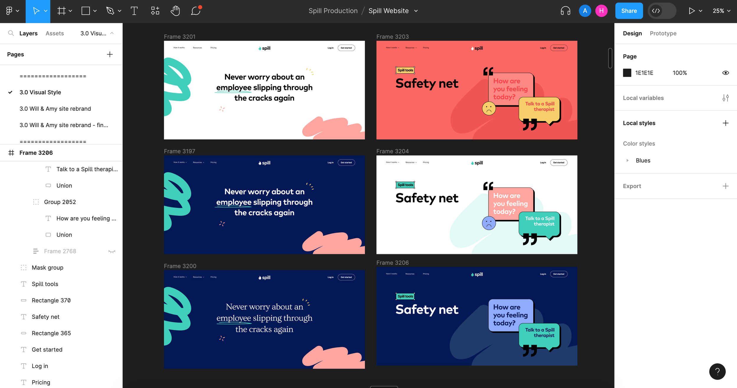
A large portion of the digital rebrand was to explore and play out different visual styles which flexed different parts of Spill’s personality. Should Spill look more therapy based, more friendly & conversational or more like a helpful tech tool.
After sharing and testing different visual routes - and with the knowledge gained from the brand workshops - I began to hone in on one visual style and define how that might look in different scenarios.


a friendly saas product
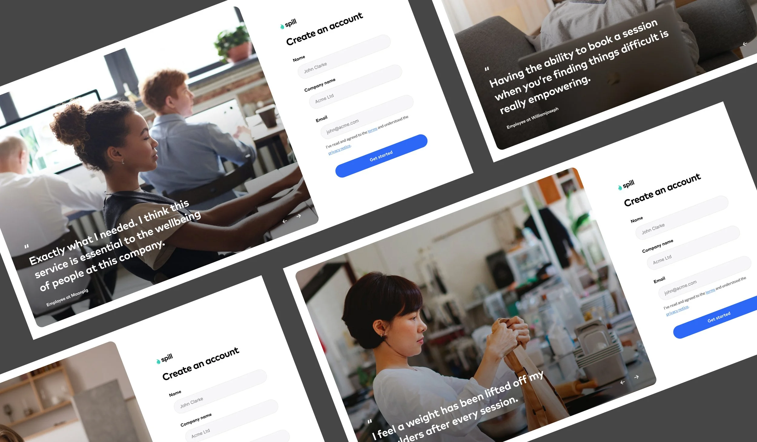
The chosen identity needed to feel like a professional, useful, trustworthy tool for both buyers and end users. A combination of warm photography, clean white space and subtle product illustrations helped achieve this goal.


Custom Illustrations
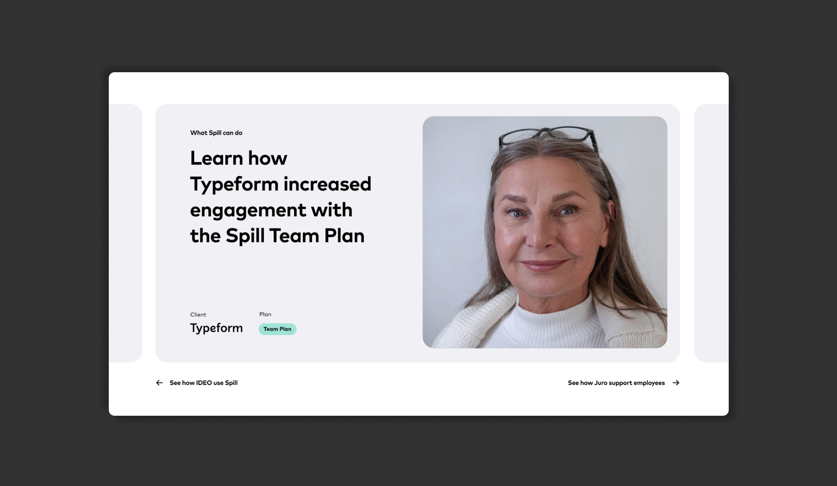
I created a series of UI assets for use across Spill’s website and marketing materials. These depict the product’s main features and help potential buyers understand the benefits in a nutshell.

the growing need for a design system
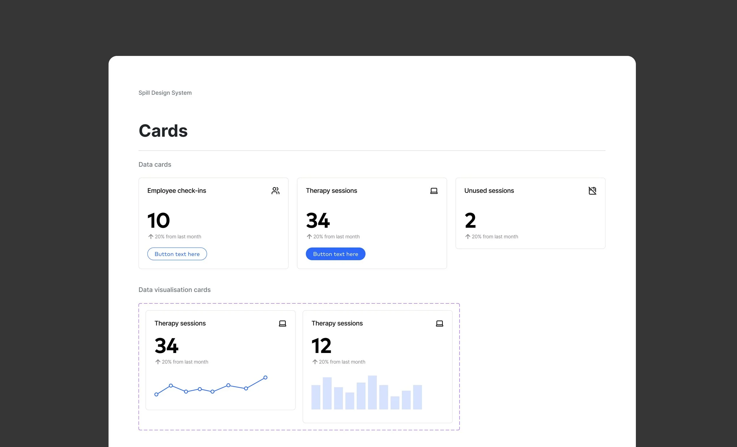
Towards the end of my time at Spill it became clear that the customer facing product needed some structure and design thinking. Product managers, engineers and founders were all creating new screens and components which left the product looking inconsistent and unfinished.
I devised a (3 week) plan for the new system and communicated the benefits this could bring; efficiency, consistency, quality and cost savings.


Guiding principles
Having already spent several months working on the buyer website, I developed a solid understanding of the guiding principles that would inform the product's direction. These naturally focused more on intuitive UI and usability.
The final principles agreed were:
Trustworthy / Approachable / Professional / Clean / Meticulous


I worked with the engineering and product teams in great detail - ensuring the feasibility and future use of the system. Every detail was refined and all components were designed to be super flexible using auto-layout and element properties.
