METTLE MOBILE BANK

Designing new features for Mettle Bank
Mettle is a mobile bank account tailored to self-employed individuals. Being part of the NatWest Group, it benefits from a large user base and a continuous stream of new features.
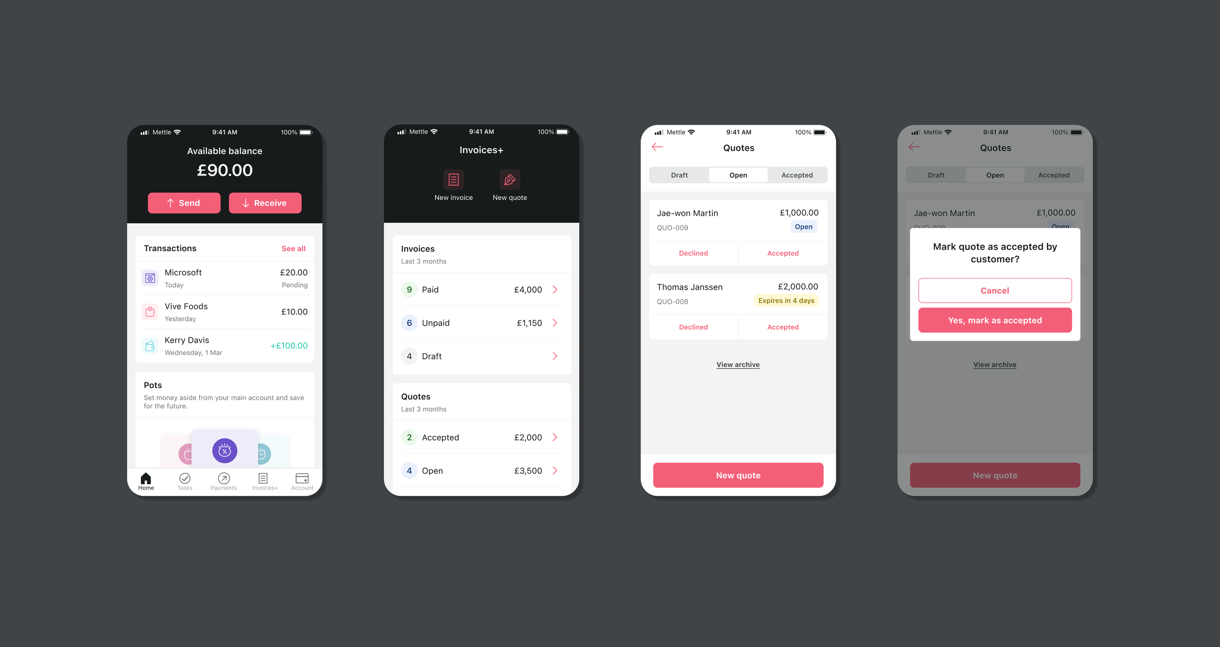
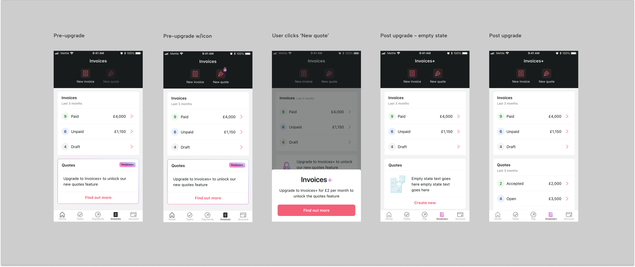
I was brought on as a contractor to help test and launch a new flow for their upcoming quoting feature. This feature was designed to significantly improve the user experience for self-employed individuals by making it possible to create, send, and track quotes on the app. Users would also be able to convert quotes into invoices and send via email.
THE APPROACH
The project was split into three main phases:
1. Discovery
2. UX Design
3. UI Design
During the Discovery Phase, we focused on existing requirements, previous user testing outcomes, and preparing scripts and prototypes for further testing.
Following this, we transitioned into the UX and UI Design Phases. Weekly meetings with the Head of Design were scheduled in advance to review and approve UX designs before progressing to the UI phase. I also participated in weekly design team meetings to share UI updates and align with the development team.
TESTING
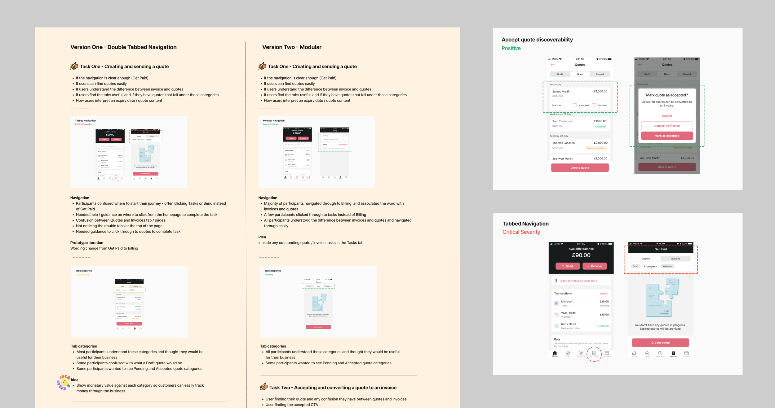
There was a need to understand how users were currently creating and sending quotes, so testing was divided into two parts - user interviews and a usability test. I used this foundational information to design the most impactful & intuitive experience for users.
Stand out findings: The majority of self employed individuals have very manual ways of tracking quotes and invoices - often using spreadsheets or hand written logs. Quotes are often sent as an email before being turned into an invoice. These tasks are time consuming and spread over multiple platforms.
Challenges: Initial usability test highlighted some confusion with the way quotes fitted in with the current navigation. A wider navigational change was needed to resolve this which had implications on other teams.
Solutions: I used an A/B test as part of this round of testing to confirm the issue and test the potential solution. This meant there was enough backing to warrant time spent on the bigger nav change. The solution was also future proofed meaning features could be added without further UX challenges.
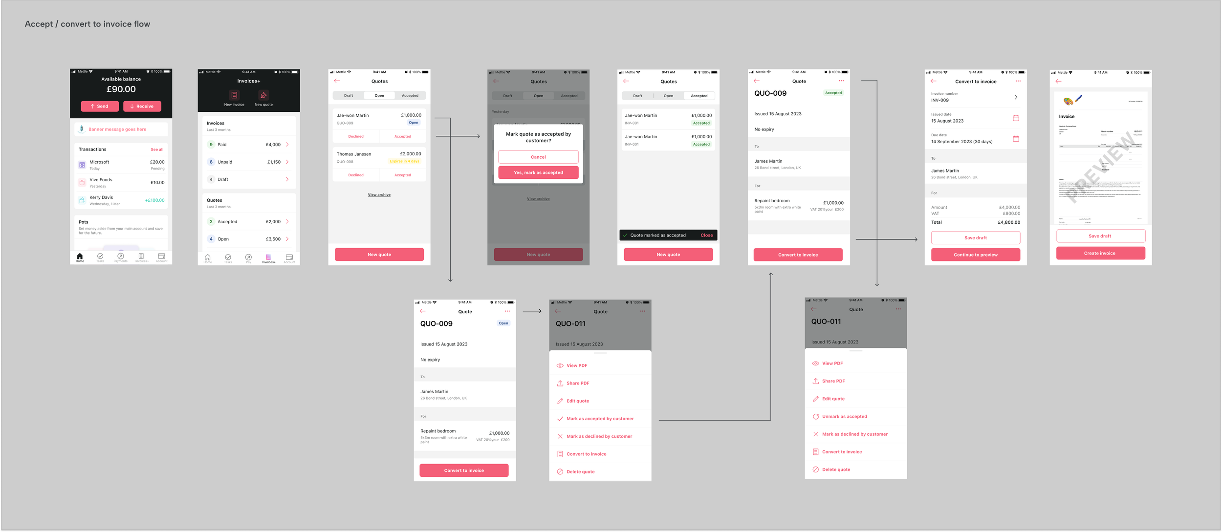
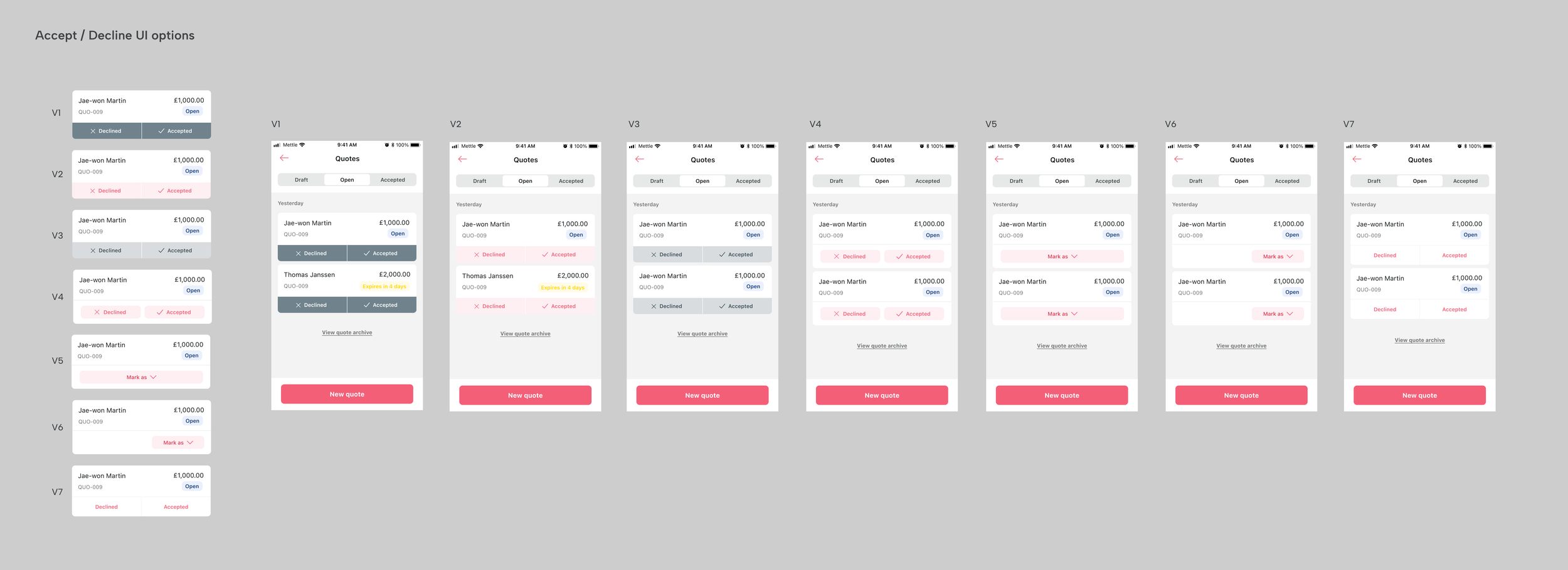
With a strong focus on design collaboration, I shared UI details with the team in weekly meetings. This allowed me to quickly get feedback and uncover potential components for re-use.
The testing uncovered a need to be able to 'accept' or 'decline' a quote, changing its status and organising the quote accordingly.

BRAND WORK
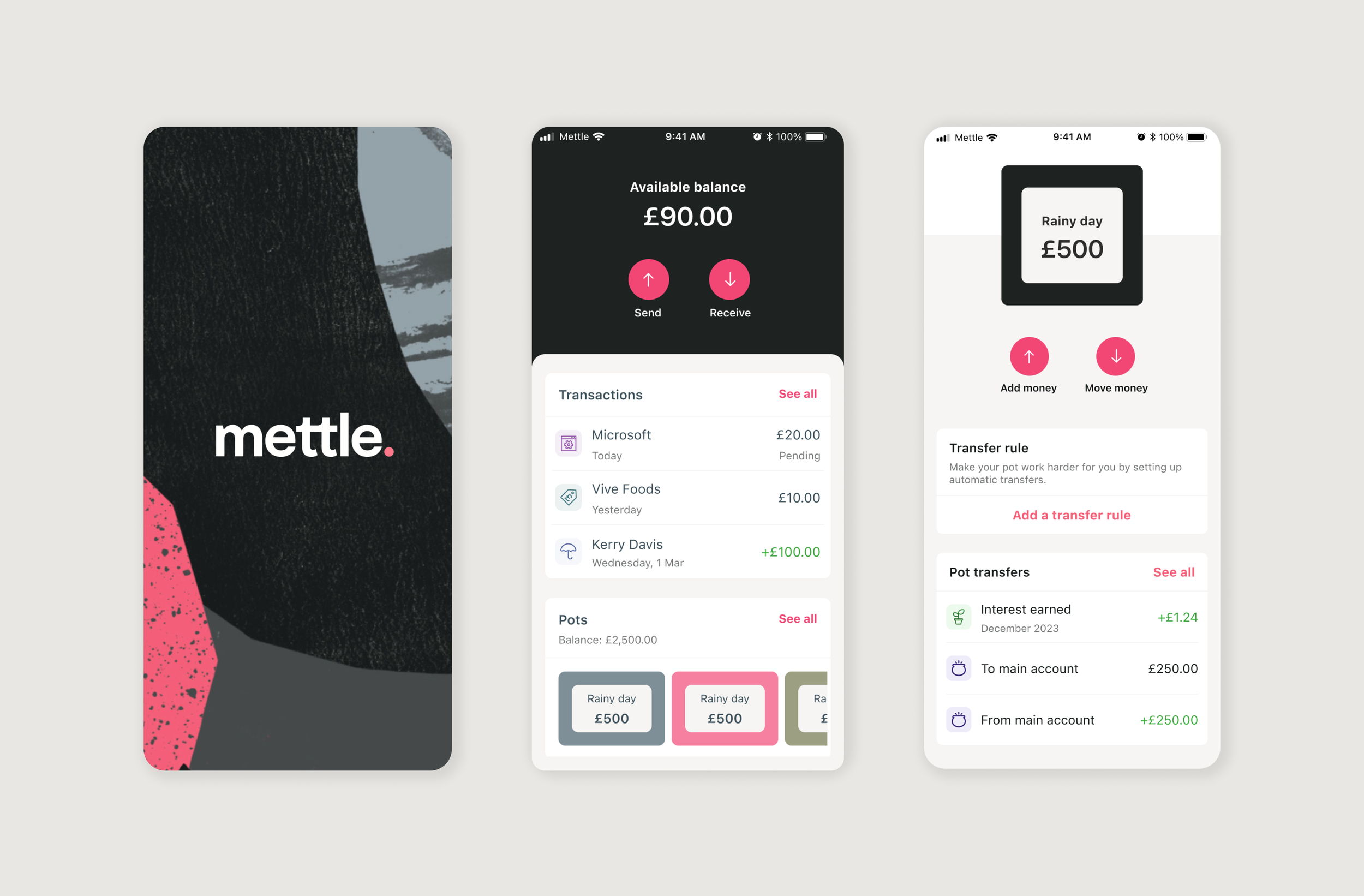
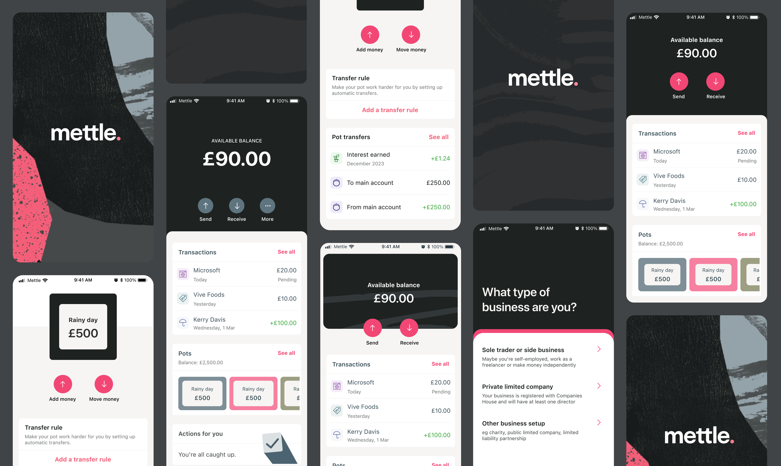
As a side project a handful of us worked on a UI uplift for the wider Mettle brand. A visual designer had created a series of textures and patterns to be incorporated in the UI. I focused on how the textures could be used in appropriate areas such as splash screens and login screens. I also looked at how these elements could work with a new, brighter pink. The aim was to give everything a fresh and vibrant feel, while maintaining simplicity and ease of use.
